Precious Metal Paints
Real Precious Metal Paint: Gold, Silver, Platinum, Diamond & Gem-Infused Paint
Real gold paint for walls, real silver wall paint, luxury architectural finishes, diamond paint, platinum paint, rhodium paint, gemstone paint, precious metal infused paint
July 5, 2026
Real precious paint is not just a metallic finish; it's a luxury architectural coating made with real gold, silver, or diamond. Explore how these materials interact with light to create unmatched depth, warmth, and brilliance.
What Is Real Precious Metal Paint?
How Gold, Silver, Platinum, Diamond, Rhodium, Palladium, Ruby, Emerald, and Sapphire Create a Deeper Class of Architectural Finish
Ordinary architectural coatings serve a function: to cover a surface, deliver a hue, and establish a specified sheen. Aether Vernice proposes a different principle entirely. Our finishes are not merely color on a wall, but color defined by material.
This concept is the foundation of our atelier. We produce architectural finishes formulated with authentic precious materials—silver, gold, platinum, rhodium, palladium, and diamond—which are meticulously processed and micron-refined for stable suspension within a proprietary binder system. This technology creates optical phenomena, such as directional luster and dynamic depth under oblique illumination, that conventional metallic and pearlescent pigments cannot replicate.
A surface is rarely perceived in static, frontal viewing. It is experienced through the cool wash of morning, the raking angle of late afternoon, the focused glow of a table lamp, and the flicker of candlelight. While a standard paint may appear uniform, it remains optically inert. A finish infused with precious materials introduces a dynamic response: the material itself governs the interaction with light.
Real Precious Paint Is Not Just Metallic Paint
Many coatings are marketed as “metallic” or “pearlescent.” These often rely on mica flakes, synthetic pearlescent structures, or aluminum particles to simulate the appearance of metal. The distinction of a real precious paint is one of origin and intent.
In an Aether Vernice coating, the objective is not to imitate metal, but to integrate the metal itself into the architectural surface. This introduces a more nuanced color language for the designer. One specifies not merely “red,” but a red warmed by the intrinsic spectral properties of gold; not simply “gray,” but a gray sharpened by the cool reflectivity of silver or rhodium; not just “white,” but a white lifted by the crystalline refractive signature of diamond.
Aether Vernice’s ASI, or Aether Spectral Identity™, codifies this relationship, ensuring the specified material identity on paper translates with high fidelity to the finished surface on the wall.
Why Real Metal Changes the Look of Paint
The perception of color is a function of reflected light. When photons strike a surface, some wavelengths are absorbed and others reflect to the observer’s eye. Flat, particulate pigments, such as those in conventional paints, tend to scatter light diffusely, creating a uniform color field.
Metals, by contrast, exhibit specular reflection. Their ordered crystalline structures and free electrons reflect light directionally, producing highlights, movement, and a tangible sense of depth. In a precious paint, the base pigment and the micron-refined material function in concert. The pigment provides the foundational hue; the precious content imparts a second, more complex optical dimension.
Gold is a classic example. Its characteristic luster is not arbitrary; gold’s specific optical properties result in the strong reflection of longer wavelengths of light (yellows and reds) while absorbing blue light. This physical reality is why micron-refined gold imparts a palpable warmth to a finish. A deep red infused with gold carries a subtle amber undertone that a standard red pigment cannot organically produce. The result is not merely red paint with decorative flecks; it is a red finish imbued with material warmth.
How Gold Enhances Red, Burgundy, Cream, and Black
Gold introduces warmth, a powerful tool in architectural color strategy.
When micron-refined gold is integrated into a red, burgundy, oxblood, or maroon finish, the color gains dimension and radiance. It appears warmer in soft illumination, richer under evening light, and more luminous as light moves across its surface. Such a finish is particularly effective in dining rooms, private lounges, powder rooms, luxury retail environments, and yacht interiors where dramatic feature walls are specified.
Gold also transforms neutrals. Within a palette of cream, ivory, or warm white, gold can impart a subtle champagne undertone. In black or charcoal, it creates a sophisticated contrast between a dark architectural base and warm metallic depth. The most luxurious applications are often restrained, aiming not for overt gilding but for a richer internal glow.
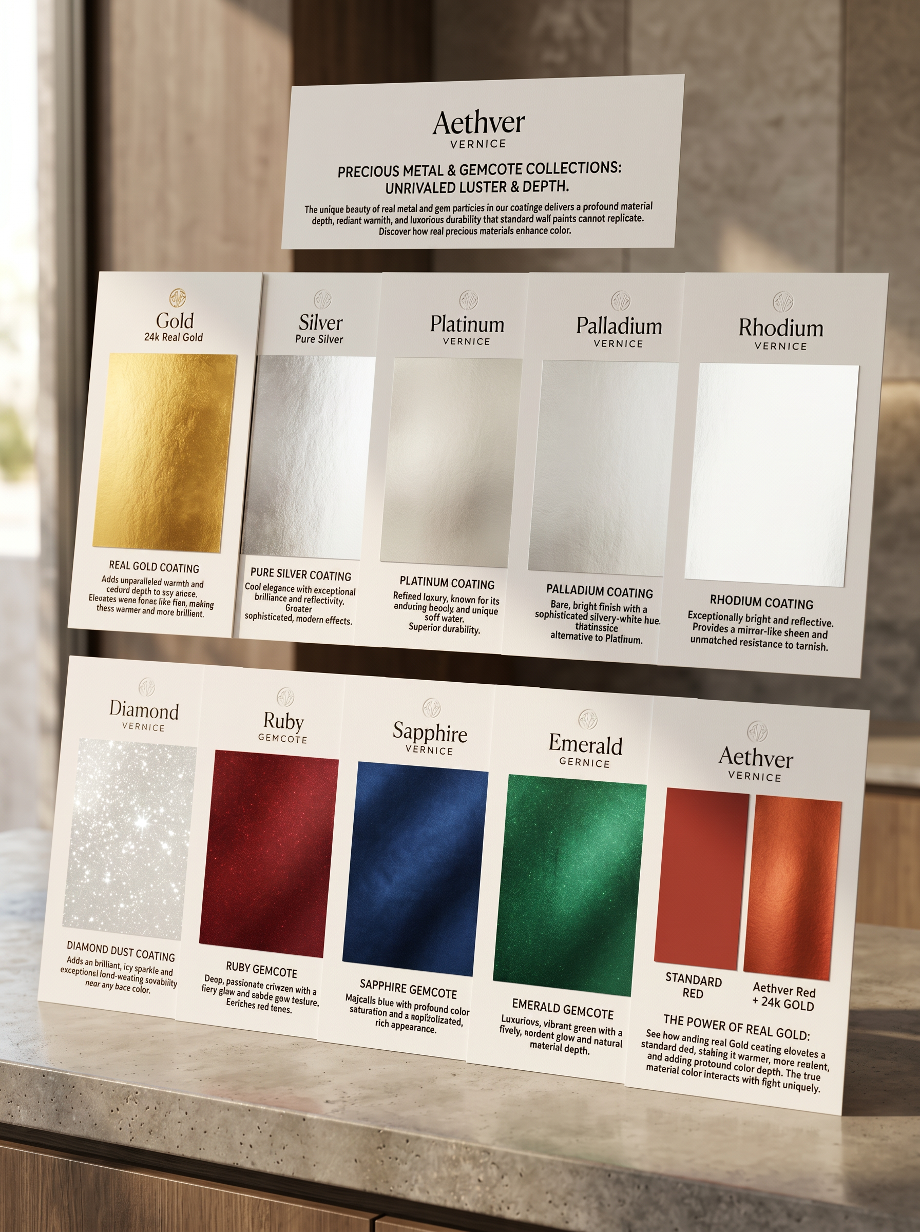
How Silver Creates Cool Luster and Clarity
Silver holds a unique position in architectural coatings due to its exceptional optical brightness. As noted by the Royal Society of Chemistry, silver is the most reflective of all metals for visible light, the very property that makes it ideal for mirrors.
In a paint system, this reflectivity gives silver a distinct design function: optical clarification. It can make whites appear crisper, grays cleaner, and blues more piercing. It adds a refined metallic character without introducing the warmth of gold.
A silver-infused finish is well-suited to modern interiors, galleries, private aviation cabins, contemporary living spaces, and high-end commercial design. Where gold introduces warmth, silver imparts cool luminosity.
Platinum: Quiet Prestige and Cool Sophistication
Platinum’s character is distinct from that of silver. It is a silvery-white metal valued for its considerable density, chemical resistance, and inability to oxidize in air, as documented by the Royal Society of Chemistry.
In an architectural coating, platinum signifies restraint, permanence, and quiet prestige. It is less optically assertive than silver and ideal for finishes where the luxury must be felt rather than announced. Its understated luster enhances soft grays, greiges, deep navies, and refined off-whites, lending them a cooler, more exclusive character. A platinum-infused coating is appropriate for elevated residential interiors, boutique hotel suites, and formal spaces where the finish itself must communicate value without overt decoration.
Palladium: Soft Silver-White Depth
A member of the platinum group, palladium is a lustrous, corrosion-resistant, silvery-white metal. In visual terms, it belongs to the family of cool precious metals but offers a softer, more atmospheric quality than the high brilliance of silver or rhodium.
Within a coating, palladium is useful for creating smoky neutrals, soft charcoals, and understated blue-grays. It can lend a finish an intelligent, subtle depth—a surface that rewards close study. Palladium is the material of choice when a designer seeks a precious effect that does not immediately declare itself.
Rhodium: High-Brilliance Architectural Luster
One of the rarest platinum-group metals, rhodium is prized for its extreme reflectivity and resistance to corrosion. The Royal Society of Chemistry highlights its use in optical instruments and headlight reflectors.
In a precious paint system, rhodium delivers a crisp, technical luster. It can make whites appear sharper, blacks more polished, and grays more architectural. Rhodium is particularly effective for dramatic designer surfaces where the light-play must feel clean, rare, and precise. If gold is warmth and silver is clarity, rhodium is brilliance.
Diamond: Crystalline Sparkle and Surface Presence
As a material, diamond offers a different optical effect than metal. The Gemological Institute of America (GIA) places diamond at 10 on the Mohs scale of hardness, defining its exceptional resistance to scratching.
Within an architectural coating, diamond functions as a luxury optical additive. Its value is not in making a wall diamond-hard—the durability of any coating is a function of the entire system, from resin to substrate—but in creating a crystalline light effect. Micron-refined diamond particles produce controlled points of scintillation, a refined, star-like optical quality distinct from common glitter. It performs beautifully in whites, pearls, silvers, and deep jewel tones where subtle points of light enhance surface presence.
Ruby: Red With Gem Depth
Ruby is a member of the corundum mineral family, a gemstone the GIA notes for its hardness (9 on the Mohs scale) and excellent toughness.
In a precious paint finish, ruby provides the ideal material identity for reds, burgundies, and dramatic warm palettes. A ruby-infused coating gives red a gemstone quality—deeper, more saturated, and more romantic than can be achieved with pigment alone. These finishes are ideal for dining rooms, private bars, and intimate spaces designed around warmth and drama.
Emerald: Green With Luxury Saturation
Emerald imparts a rich, mineral identity to green architectural coatings. Where conventional green paint can appear optically flat, an emerald-infused finish feels deeper and more luxurious.
It finds its natural place in palettes of forest green, jade, malachite, and deep teal, pairing elegantly with brass, walnut, and dark stone. Aether Vernice emerald coatings are specified by designers who intend for a green surface to read as a precious material, not merely as a color.
Sapphire: Blue With Depth and Cool Radiance
Also a form of corundum, sapphire shares the same mineral hardness and structure as ruby. It brings a profound depth to blue hues.
In a precious paint context, sapphire is ideal for navy, midnight blue, and steel blue, making the color feel more architectural and resonant. The most successful sapphire-inspired finishes suggest depth, not decoration, creating a blue that shifts with the light like a luxury material. These coatings are particularly powerful in studies, lounges, and private theaters where atmosphere and elegance are paramount.
Why Precious Paint Can Feel More Durable
Durability in an architectural coating is a property of the entire system: the binder chemistry, resin quality, film thickness, substrate preparation, and curing conditions.
That being said, a precious-material coating is engineered for a different performance class. The value resides in the combination of authentic material, controlled particle processing via our micron-refinement method, and a carrier medium designed for exceptional adhesion and color fidelity. Furthermore, the precious metals themselves are historically valued for material stability—silver for its reflectivity, platinum and palladium for corrosion resistance, rhodium for its brilliant, non-tarnishing surface. A coating does not become industrial plating, but it borrows the material identity of these noble substances, translating their permanence into a durable and visually sophisticated architectural finish.
Why Precious Paint Looks Different From Big-Box-Store Paint
Conventional decorative paints are engineered for volume, accessibility, and ease of use. While practical, their design is centered on pigment and sheen, not material depth.
A real precious paint introduces another dimension:
- It generates a dynamic, directional sheen under oblique light.
- It produces subtle optical movement as the viewer’s position changes.
- It can make a color feel warmer, cooler, or deeper based on the specific material identity.
- It can create a surface with a sense of tangible luxury, rather than a simple painted plane.
- It can transform a wall, ceiling, or architectural detail into a specified, high-design object.
The distinction is best understood in person. A standard red wall reflects red wavelengths of light. A red wall infused with micron-refined gold is red plus the material warmth and radiant depth of gold itself. A standard gray wall is a neutral color. A gray wall enhanced with silver, platinum, palladium, or rhodium can feel sharper, softer, or more brilliant, depending on the chosen metal. This is the difference between color and color with material integrity.
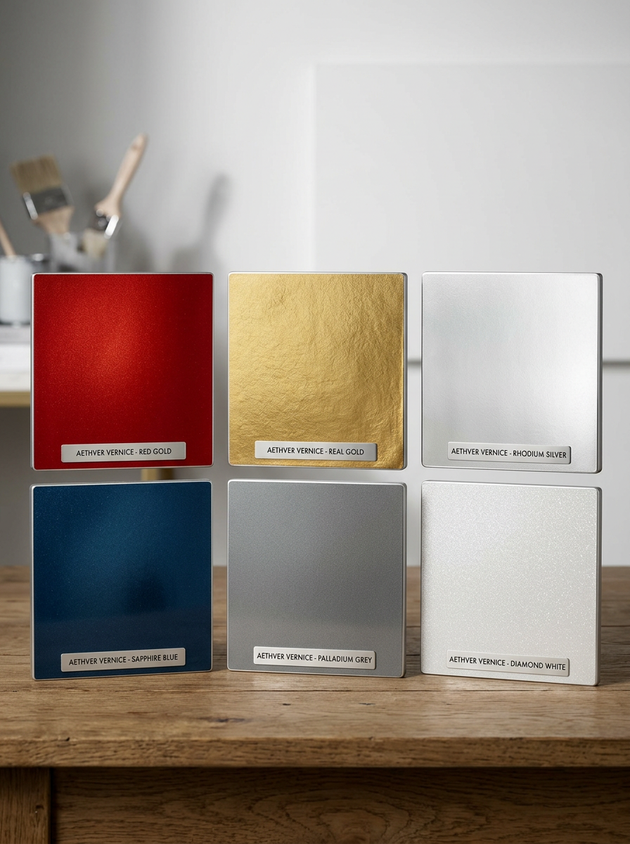
The Aether Vernice Precious Material Palette
Aether Vernice is designed for clients and designers who require finishes beyond the scope of conventional paint. Our palette is defined by material identity:
- Silver for cool luminosity and optical clarity.
- Gold for material warmth, radiance, and richness in reds, creams, and blacks.
- Diamond for crystalline scintillation and a refined, light-scattering presence.
- Platinum for quiet prestige, cool sophistication, and an understated silvery-white depth.
- Palladium for a soft silver-white luster, smoky neutrality, and intelligent, subtle luxury.
- Rhodium for crisp architectural brilliance and a rare, high-performance sheen.
- Ruby for reds and burgundies with authentic gemstone depth and saturation.
- Emerald for deep greens with a rich, mineral character.
- Sapphire for deep blues with cool, resonant depth.
Together, these coatings allow designers to create architectural surfaces specified not simply by color, but by the physical and optical properties of the material itself.
A New Category: Architectural Finishes With Precious Material Identity
The future of luxury surface design lies not in more nuanced color matching, but in material-specific color. Aether Vernice treats paint as an architectural finish to be specified by hue, precious material, luster, and Aether Spectral Identity™ (ASI).
This offers designers a more profound vocabulary. The discourse shifts from “What color should the wall be?” to more sophisticated questions:
- Should this red be warmed by gold?
- Should this white be lifted by diamond?
- Should this gray be sharpened by rhodium?
- Should this navy carry sapphire depth?
- Should this green possess an emerald’s mineral character?
- Should this neutral convey the quiet prestige of platinum?
This is the power of real precious paint. It gives color a material story. It gives walls another layer of meaning. It elevates an ordinary surface into an object of design.
Conclusion: Buy Precious. Not Plastic.
Real precious paint is not an exercise in ornamentation. It is the practice of creating depth, luster, and material presence through authentic composition. Gold can make a red warmer and more radiant. Silver can lend cool colors a clean, luminous clarity. Platinum and palladium can instill quiet prestige, while rhodium can sharpen a space with modern reflectivity. Diamond adds points of controlled crystalline light. Ruby, emerald, and sapphire transform color into surfaces of gemstone-inspired depth.
Ordinary paint covers a wall.
Aether Vernice changes the nature of the surface itself.